Show the code
pacman::p_load(plotly, DT, patchwork, ggstatsplot, tidyverse)In this exercise, we will explore Singapore’s flat resale data. The data was extracted from Singstat.
First, load the necessary libraries using pacman.
pacman::p_load(plotly, DT, patchwork, ggstatsplot, tidyverse)In this exploration, we will focus on 2022 resale records, and 3/4/5-room flat type only. Based on Singapore’s area plan, each town has been grouped as “North-East”, “Central”, “East”, “North” and “West”. For detailed list of each town in respective region, you may refer to code below.
data <- read_csv("data/resale-flat-prices-based-on-registration-date-from-jan-2017-onwards.csv")Rows: 146215 Columns: 11
── Column specification ────────────────────────────────────────────────────────
Delimiter: ","
chr (8): month, town, flat_type, block, street_name, storey_range, flat_mode...
dbl (3): floor_area_sqm, lease_commence_date, resale_price
ℹ Use `spec()` to retrieve the full column specification for this data.
ℹ Specify the column types or set `show_col_types = FALSE` to quiet this message.resale_data <- data %>%
mutate(region =
case_when(town %in% c("ANG MO KIO", "HOUGANG", "PUNGGOL", "SERANGOON", "SENGKANG") ~ "North-East",
town %in% c("BISHAN", "BUKIT MERAH", "BUKIT TIMAH", "CENTRAL AREA", "GEYLANG", "KALLANG/WHAMPOA", "MARINE PARADE", "QUEENSTOWN", "TOA PAYOH") ~ "Central",
town %in% c("BEDOK", "PASIR RIS", "TAMPINES") ~ "East",
town %in% c("SEMBAWANG", "WOODLANDS", "YISHUN") ~ "North",
town %in% c("BUKIT BATOK", "BUKIT PANJANG", "CHOA CHU KANG", "CLEMENTI", "JURONG EAST", "JURONG WEST") ~ "West")) %>%
filter(flat_type %in% c("3 ROOM", "4 ROOM", "5 ROOM")) %>%
filter(month >= '2022-01' & month <='2022-12')To start with, let’s see the distribution of resale price by region. Histogram is a good visualization method to see the trend of price range. Each count of resale data in 2022 were plotted to this histogram. All the price range follows SGD ($).
To plot a histogram, you can use geom_histogram(). As we need to compare the spread of each histogram, you may set alpha value so that each plot will look translucent. You may also set different bins value. Bigger bins value will result in smoother histogram. When hovering over the histogram, you will find details of each sales count in a tooltip.
library(ggplot2)
library(scales)
Attaching package: 'scales'The following object is masked from 'package:purrr':
discardThe following object is masked from 'package:readr':
col_factorp <- ggplot(resale_data, aes(x = resale_price, fill = region)) +
geom_histogram(position = "identity", alpha = 0.3, bins = 100) +
labs(title = "Resale Price Distribution by Region",
x = "Resale Price",
y = "Frequency") +
scale_x_continuous(labels = comma)
ggplotly(tooltip = c("fill", "x", "y"))Key findings:
Central has the widest resale price range, meaning that price difference gap is wide in this area.
North, North-East and West area has narrow resale price range, indicating that resale price of these areas could have been rationalized.
Moving forward to take a closer look at each region, the histogram will be split by region and by flat type - 3/4/5-room. To effectively see the necessary statistic trends, a boxplot chart is an appropriate choice to plot the data. In this boxplot chart, you can see the percentile information, outliers and spread of resale price records. In ggplot, you can set fill value as flat_type to see resale price by region and by flat type.
library(plotly)

p1 <- ggplot(data=resale_data, aes(x=region, y=resale_price, fill=flat_type)) +
  geom_boxplot() +
  labs(title = "Resale Price by Region and Flat Type",
       x = "Region",
       y = "Resale Price") +
  scale_y_continuous(labels = comma)
Key findings:
Central area has extreme outliers, especially in 5-room type flats. These outliers could be the reason of wide spread in Central area’s resale price distribution.
Generally, 3-room type flats’ resale prices are pretty much regularized, compared to 4 or 5 rooms flats. As in the box plot, mean of 3-room type flats in each region are distributed at the similar price range.
North region has the least outliers compared to the rest of regions. It could be due to a lot of HDB residences, whose price is rationalized by the government.
Based on key findings from resale price by region and by flat type, the count of resale records could have affected the mean and spread of flat price. Stacked bar chart will show the percentage of 3/4/5-room type in each region.
To plot stacked bar plots, you can use geom_bar() and set position as “fill”. Since we are counting the number of sales record, stat will be set as “count”. Since we want to know percentage result, y axis will be modified on a 100% scale. Last but not least, you will find details of each sales count in a tooltip by adding ggplotly.
p2 <- ggplot(resale_data, aes(fill = flat_type, y = after_stat(count), x = region)) +
  geom_bar(position = "fill", stat = "count") +
  scale_y_continuous(labels = scales::percent_format()) +
  ggtitle("Resale Types by Singapore Region")
ggplotly(p2, tooltips = c("x", "y: %{y*100}%", "fill"))
Key findings:
In all regions, 4-room flat is the most common type of flat. This indicates that 4-room flat may have the highest demand or supply in the resale market.
3-room type flat takes the highest percentage in central area, which is almost at the similar share with 4-room type. This observation could be due to relatively more expensive flat price and smaller flat size in this area.
Other than room type, lease commence date may affect the price as well. By using ggscatterstats, we can see the necessary stats information together with scatter plot. It will come together with trend line as well, so that we can see how the resale price changes over time. Similar to previous charts, you may add tooltips to see the data point of outliers.
p3 <- ggscatterstats(
  data = resale_data,
  x = lease_commence_date,
  y = resale_price,
  marginal = FALSE,
  ) +
  labs(title = "Resale Price by Lease Commence Date",
       x = "Year",
       y = "Resale Price") +
  scale_y_continuous(labels = comma)
ggplotly(p3, tooltips = c("x", "y", "text"))
Key findings:
Resale price is increasing over time, with significant p-value of less than 0.05.
The trend indicates that the newer the flat is the more expensive the resale price is.
Based on previous findings, we can tell these two regions - Central and North - are at the most extreme end in terms of well-selling flat types as well as price range. Therefore, we will look into these regions using violin plot. Violin plot can be created by using geom_violin(). You may overlay boxplots to each violin plots using geom_boxplot(). To make the visualization look less crowded, you may set the color of boxplot in monochrome by setting the color attribute as grey.
p4 <- resale_data %>%
  filter(region == "Central") %>%
  ggplot(aes(x=town, y=resale_price, fill=town)) +
  labs(title = "Resale Price by Town - Central",
       x = "Town",
       y = "Resale Price") +
  geom_violin() +
  geom_boxplot(width=0.1, color="grey", alpha=0.2) +
  scale_y_continuous(labels = comma) +
  coord_flip()

p4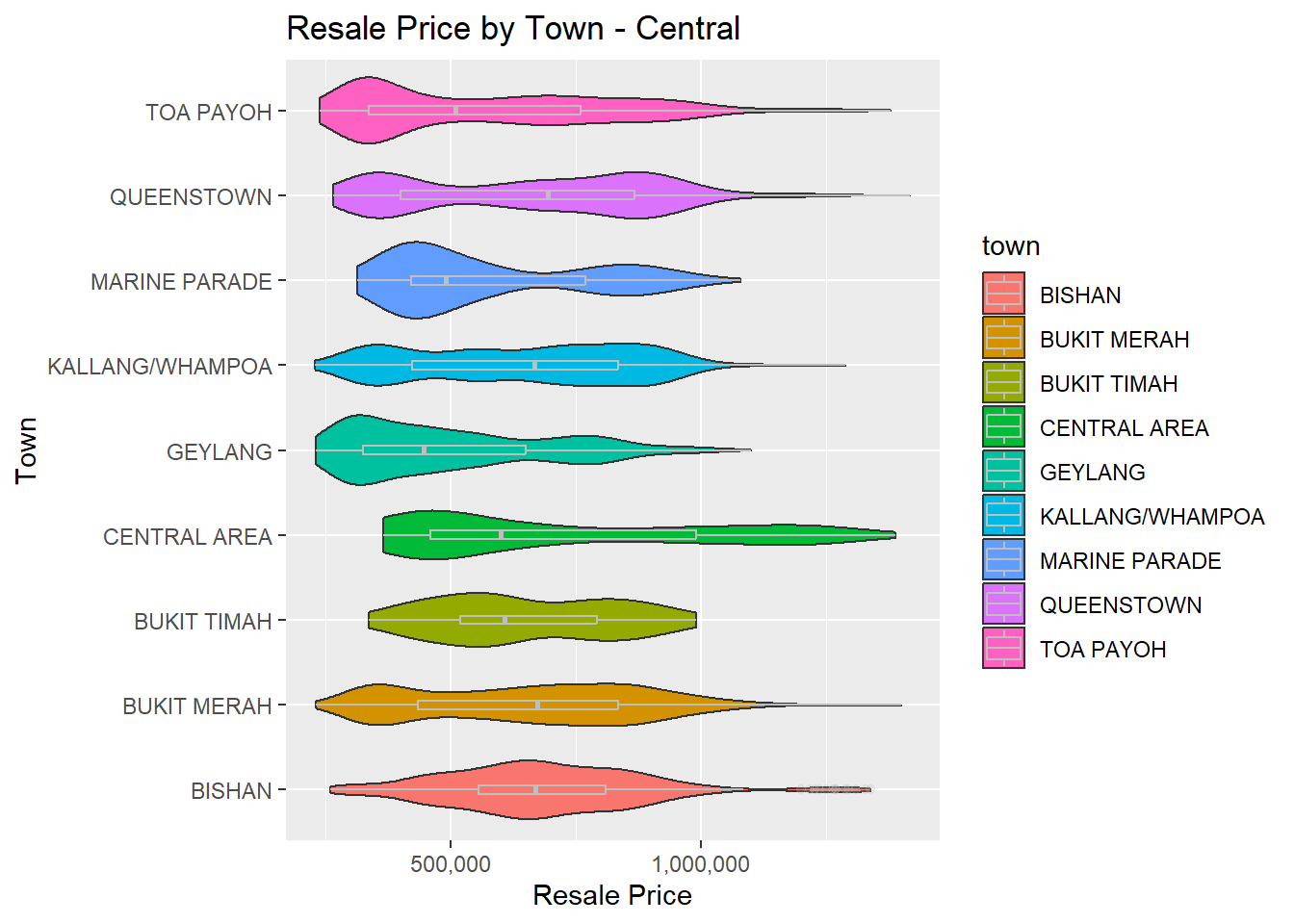
p5 <- resale_data %>%
  filter(region == "North") %>%
  ggplot(aes(x=town, y=resale_price, fill=town)) +
  labs(title = "Resale Price by Town - North",
       x = "Town",
       y = "Resale Price") +
  geom_violin() +
  geom_boxplot(width=0.1, color="grey", alpha=0.2) +
  scale_y_continuous(labels = comma) +
  coord_flip()

p5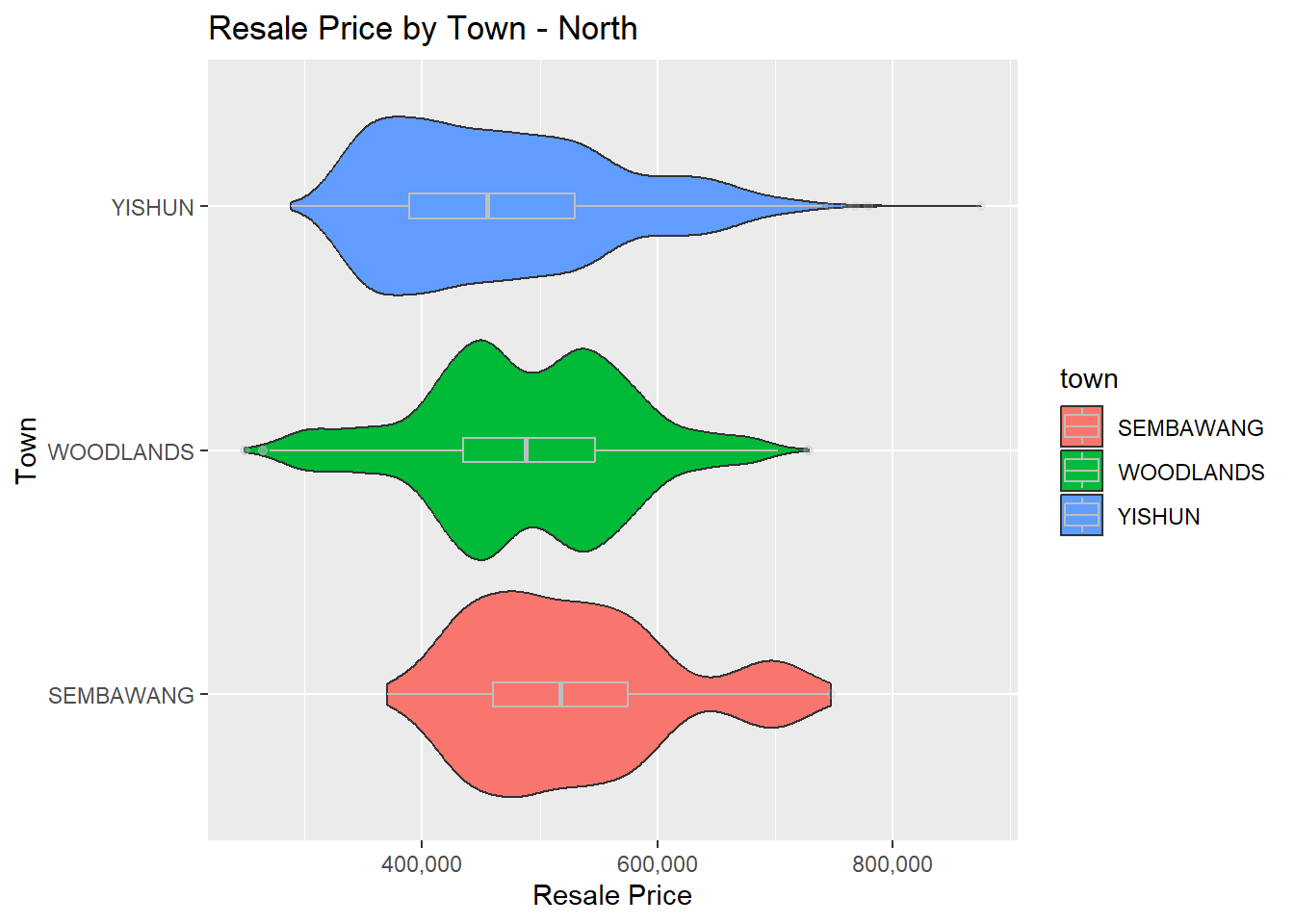
Key findings:
Spread of resale price is wide in all Central area towns
Among the towns in Central area, Geylang has the lowest median and thicker base in its violin plot. It indicates that this area is relatively more affordable in the Central area.
Bukit Timah and Bukit Mera have less curvy shape in their violins. It may indicate that their price is relatively stable than the other towns.
In North region, spread of resale price is less extreme than Central area. - Yishun has outliers in resale price. Based on previous finding from lease commence date chart, we may investigate further to see if Yishun have newer residential area plans, which may resulted in many outliers here.